
We are collecting air temperature, air humidity and PM data in cities around the world. We use air temperature and humditiy to calculate the wet-bulb temperature as a proxy for heat stress. You can explore the data by clicking on your city of interest from the list on the left-hand panel and then selecting a sensor ID (see more details about the data explorers below).
The raw temperature and humidity data collected are processed to remove potential errors and to make them easier to visualize in an interactive manner. The major quality control steps followed for each sensor are:
1. Trips are separated assuming that at least 5 minutes have passed between two corresponding observations; and trips lasting less than 5 minutes are removed.
2. For each trip, data within a 150 m radius circle centered on the starting and final points are omitted. This is done to both remove cases where users turn on their Smart-T sensors inside their homes and also to protect the identity of the bicyclists.
3. The total time biked is calculated for each sensor and trip.
4 . Since the range of data varies significantly due to time of the day and season, the temperature, humidity, and wet-buld temperature data for each trip are normalized to lie between 0 and 1 (see the variables RH_norm, Temp_norm, and Tw_Numerical_norm in the data explorers).
5. Noise in the data is reduced by implementing moving averages with an averaging window of 120 secs for the variables of interest.
6. Only every 10th datapoint is kept for the visualization.
7. The normalization procedure is repeated for the new subset of data for the visualization
The image below gives an overview of the functionality of the data dashboards:
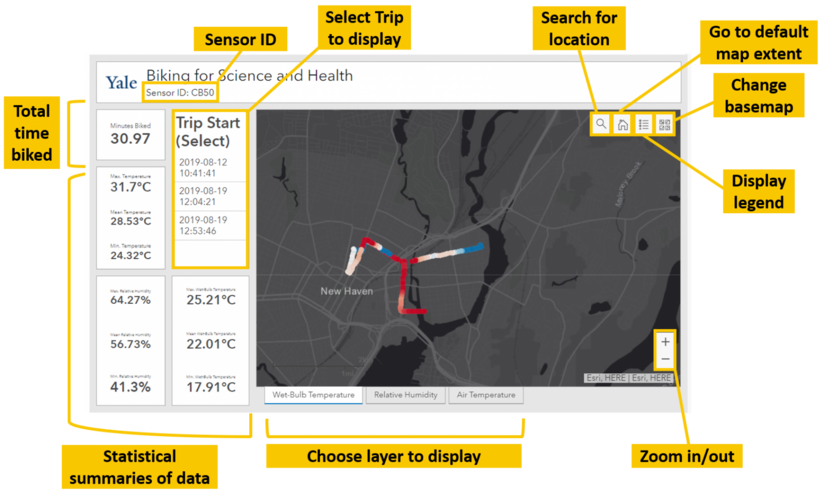
Of note, the data summaries on the left-hand columns of the dashboards are based on all the data (absolute, not normalized) left at the end of quality-control step number 3. Selecting a trip subsets the map display to only show the normalized values of the variables measured during that trip, while the data summaries are updated corresponding to the absolute measured values.
Please contact us at yceo@yale.edu if you have any feedback or questions about the data visualizations.